Skip to content

Coligo's Transformation: A Rebranding Success Story

Join us in exploring how we at Brightvision helped Coligo transform their brand. We gave their website, presentations, and infographics a fresh, new look that truly shows off their innovative spirit and focus on people in the world of IT solutions.

abstract_00029

Background

Coligo was founded in 2012 with the goal of helping organizations achieve their visions through the most secure and strategic IT solutions in the market. We have been a part of their journey since 2019. However, as both they and the world change – they needed a rebranding.
 
Through research and collaboration with the Coligo team, we identified key areas for improvement and developed a comprehensive rebranding strategy. The new visual identity reflects the company's focus on innovation, reliability, and simplicity in their approach towards solving customer's problems through technology.
 
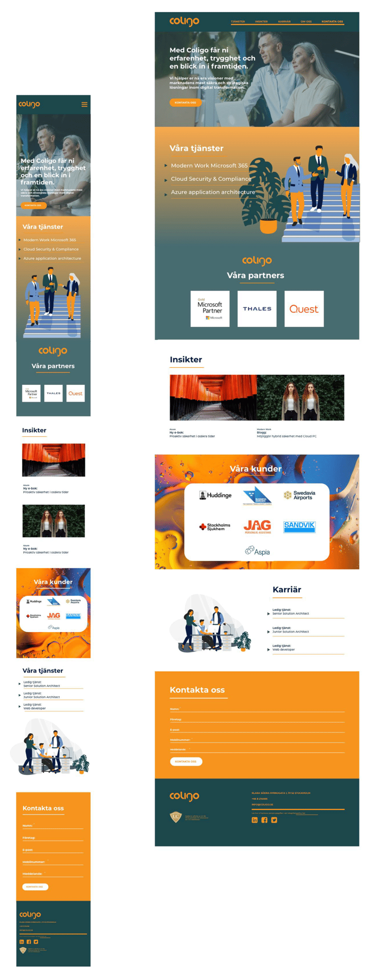
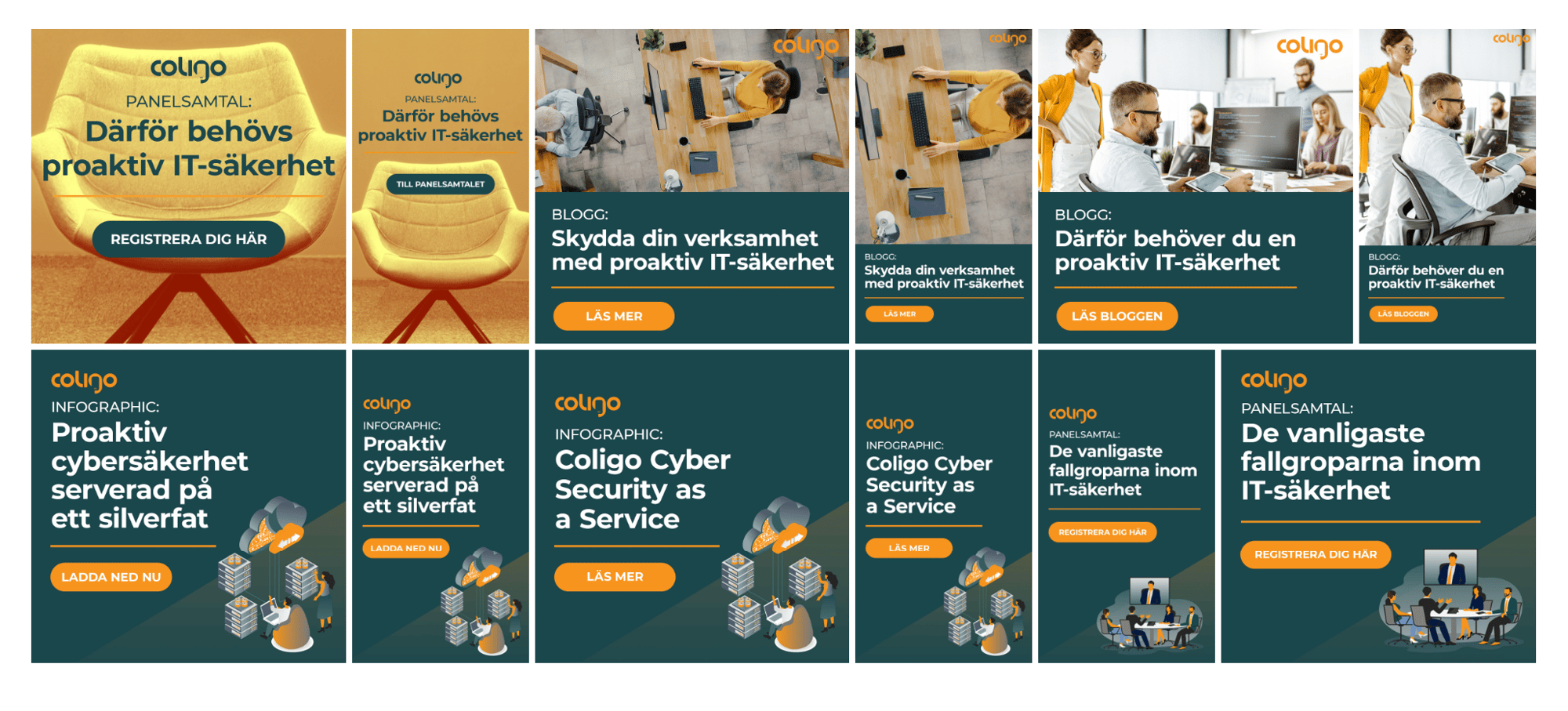
We revamped their website, added illustrations to the design language, updated the colour palette, created a new set of brand guidelines, and designed a range of marketing materials to be used across various platforms.

Website Redesign

The goal with the website redesign was to express the company’s values of “a human touch”, expertise, and that they’ll take care of problems for their clients ("we’ve got your back”). Coligo wanted to avoid a site filled with images of computers and technology, and instead wanted to showcase the people behind the processes.
 
The tagline for the redesign was "unifying people through technology". To achieve this, we included images of people's faces and images representing the customers. The original images used on the website featured a lot of people with hands and hidden faces, but we wanted to change that to create a more personal touch.
 
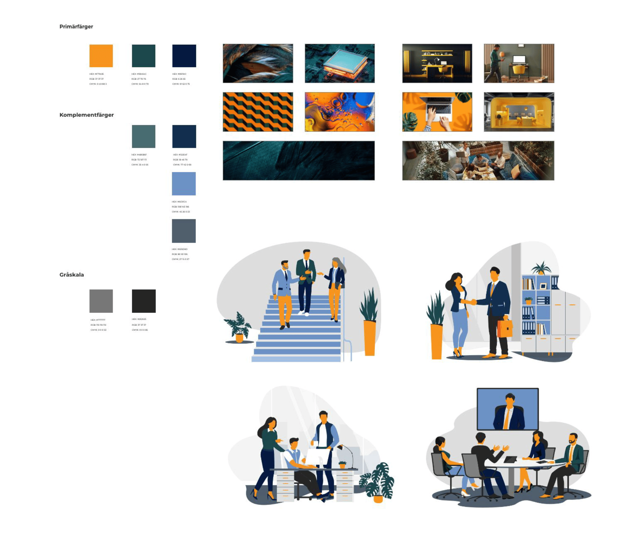
The original images used in branding were more corporate, featuring birds-eye views, computers, and coffee cups. The updated guidelines call for more human-oriented images, with additional colors and depicting people in more comfortable surroundings, to convey a more modern and relatable image, including remote working. To avoid scenes of people working in places where Coligo's services wouldn't be used, given that Coligo is an IT company.
 
Illustrations were also added to the mix as a new element, these illustrations are simple and people-oriented, emphasizing that "human touch" again in a different way.
Website redesign

Banners

Banners

Brand guidelines

The brand guidelines for Coligo were updated to prominently feature the color orange, which better represents the brand. Prior to the update, blue was the primary color and orange was not used as frequently. The goal was to make the company proud of the orange color and to increase brand recognition by using it more prominently. In addition to incorporating more orange, a new primary color, green, was added to the color palette to create harmony and complement the original primary colors of orange and blue. It was noted that images should always include at least a splash of the "Coligo orange".
Guidelines

Powerpoint Template

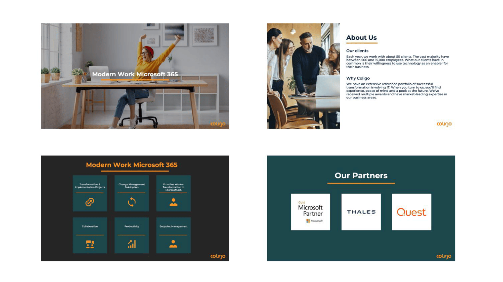
A new PowerPoint template was created to align with the updated website and brand guidelines. The focus of the template is on the primary brand colors and emphasizing the "human touch" in line with the guidelines. The template includes a variety of static slides, specifically for sales presentations. Additionally, it offers a number of slide templates that can be easily edited and updated. The template features different title slides, background colors, and a mix of slides with photos and illustrations to keep it visually interesting.
PPT template


Infographic

Proactive cyber security served on a silver platter? Exactly. That was the concept for the infographic we created for Coligo. It highlights Coligo's security service, where they help their customers maintain a high level of protection. They provide an advisory service that captures customer needs and requirements, monitors the security landscape, and keeps customers up-to-date with best practices and new functionality – as security work is not a one-time matter but something that needs to be updated continuously.
 
 The text and design of the infographic worked together seamlessly from start to finish. For example, the text begins with background information about the challenging security landscape with its many cyber threats, and the design is dark, featuring a graph that illustrates the consequences of neglecting IT security. As the infographic progresses, it brightens as it provides more information about the solution.
Infographic


Do you want to explore how you can nurture your leads with creativity? 

Contact us and we'll discuss how the power of content can accelerate your B2B tech company's sales.